
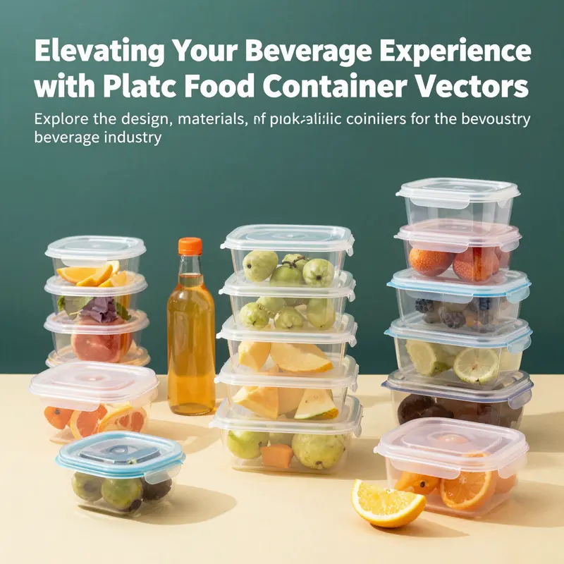
In a world where presentation is key, plastic food container vectors stand at the forefront of delivering appealing visual designs that resonate with customers. For bubble tea shops, restaurants, food trucks, catering services, and event planners, the ability to showcase products in an eye-catching way can significantly influence customer decisions. This article dives deep into the significance of plastic food container vectors, starting with design and illustration techniques that capture attention, then moving through the materials and manufacturing processes behind these containers, their applications in various industries, the environmental impacts of plastic use, and finally, the future trends that promise innovative solutions. Each chapter offers invaluable insights to help you harness the power of these vectors for your business.
From Form to Function: Mastering Vector Illustration Techniques for Plastic Food Container Graphics
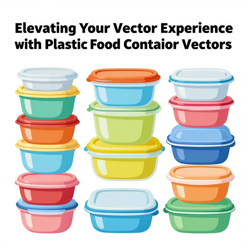
Plastic food container vectors are more than decorative images; they are the visual language for modern packaging. They carry the promise of reliability, convenience, and safety in a single scalable shape. In this chapter, we explore how designers translate real-world containers into precise vector forms, balancing aesthetic appeal with functional clarity. The journey begins with form—how a container’s geometry reflects its use—and then moves through technique, texture, and context to create visuals that feel tangible and efficient across platforms.
Conceptually, a typical plastic container resembles a box or tub crowned with a lid. Designers begin by defining the fundamental shape with clean, mathematically defined paths, setting anchors for the base, walls, lid, and any hinges or closures. This creates a reliable scaffold on which details can be layered. The result is a vector that scales without losing proportion or clarity, allowing easy changes to volume, color, or labeling without reworking the core geometry.
The heart of the technique lies in how light interacts with plastic. Gradients and shading encode material properties. A glossy PET-like surface can be suggested with sharp highlights and multi-directional gradients; a more matte HDPE or PP surface benefits from softer transitions that convey rigidity. Highlight placement follows a consistent logic: the light source location, how it skimps across curves, and where translucency informs visibility of contents.
Transparency and cutouts also play a meaningful role. Many vectors depict clear or semi-transparent walls to reveal contents. Transparent areas must be carved as clean vector windows to stay crisp at any zoom. The lid, seals, and closures deserve thoughtful rendering: a raised lip, a snap-fit indentation, or a simple hinge can be expressed with anchored shapes and subtle shadows while preserving legibility.
Consistency across views supports packaging workflows. Designers often render front, side, and top perspectives with unified scales and proportions, enabling mock-ups on shelves, screens, or educational materials. Layer organization and reusable symbols—common lid shapes, closures, or label frames—enable quick iteration with minimal change to the core geometry.
The export workflow matters: vectors are typically saved in scalable formats such as SVG or PDF, preserving resolution independence for print and digital use. Color systems are chosen to stay stable across devices, balancing brand constraints with the container’s real-world appearance.
Materials and manufacturing cues, such as PET, HDPE, PP, PS, and bioplastics, inform surface language. Each material carries associations: PET’s clarity, HDPE’s rigidity, PP’s durability, PS’s economical character, and bioplastics’ eco-friendly narrative. In vector form these cues become concise signals rather than textures to maintain legibility across formats.
The production process itself leaves traces a well-placed seam, embossing, or label indentation can suggest injection molding, blow molding, or extrusion without overwhelming the design. This storytelling supports engineers and marketers who rely on visuals to communicate ideas quickly.
Beyond packaging, plastic container vectors support educational graphics, marketing visuals, and interactive tools. A unified vector language preserves core geometry while adapting surface language and content windows to the message. Modular workflows with reusable symbols and templates enhance consistency and speed.
Looking ahead, the field embraces sustainable and interactive design language. Smart SVGs enable dynamic manipulation of content, transparency, and light. AI-assisted tools speed up iteration while keeping control over gradients and proportions, steering toward more expressive, adaptive, and responsible packaging visuals.
In sum, mastering vector illustration for plastic containers requires precision, storytelling, and adaptability. The techniques of geometry, shading, transparency, and modular workflows empower designers to craft visuals that work on shelves, screens, and classrooms while aligning with material realities and environmental considerations.
From Molecules to Molds: Translating Materials and Manufacturing into Plastic Food Container Vectors
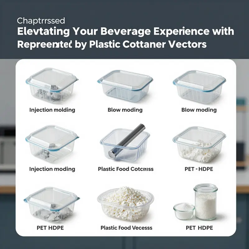
Plastic food container vectors sit at a curious crossroads between artistic representation and industrial reality. They do more than imitate the look of everyday plastics; they encode the material families, the tooling realities, and the regulatory constraints that govern real packaging. In this chapter, we explore how the most common thermoplastics—PP, HDPE, LDPE, and PET—are depicted in vector form, and how the manufacturing processes that shape those containers find visual echoes in the designs. The aim is not merely to decorate a container with gloss and glossiness, but to convey, through shape, texture, and line, the distinct properties that matter to designers, marketers, and educators alike. By examining these visual cues, we gain a window into how vectors communicate which plastic was used, how it was made, and what it can safely do in the realm of food storage and transportation. The fidelity of these representations hinges on understanding both the physical realities of the materials and the capabilities of vector tools to render them with scalable precision and expressive nuance. In turn, this understanding informs how designers select a visual language that is truthful, legible, and adaptable across packaging concepts and digital platforms. The resulting visuals become a shared vocabulary for designers and engineers, a kind of visual shorthand that helps stakeholders imagine new products without needing a physical prototype at every step. When a container is depicted in profile, with a transparent body and a distinct lid, the vector artist signals not only form but material behavior: the way light passes through a polymer, the way a seam or a ridge catches the eye, and the way a lid’s thread or gasket might be represented to suggest a functional seal. This attention to detail reflects the real-world criteria that guide packaging development, including safety, recyclability, and user experience. Among the materials, polypropylene, or PP, stands out for its combination of heat resistance, chemical stability, and FDA-approved status for many food-contact applications. In vector language, PP is often portrayed with smooth, slightly glossy surfaces and tight, uniform geometry that hints at injection-mold precision. The material’s capacity for microwave-safe use is not merely a technical footnote; it becomes a design cue. Vectors may show a container in a slightly warmer color tone or with subtle shading to imply durability under heat, while still maintaining a clean, recyclable silhouette. The presence of a rigid body and a functional lid reinforces the perception of a reusable, dependable piece of kitchenware. Another frequent protagonist is HDPE, valued for rigidity, chemical resistance, and durability in long-term storage. In vector illustrations, HDPE containers commonly appear with pronounced shoulders or vertical wall geometry that conveys strength and resilience. The recycling symbol, often labeled with the number 02 on the base in real products, is a detail that designers may choose to emphasize or abstract, depending on the educational or marketing goal of the image. The visual language for HDPE leans into solid geometry and a matte to semi-gloss finish that communicates toughness without sacrificing clarity or accessibility. LDPE, by contrast, opens a window into flexibility. This polymer underpins films, wraps, and inner linings that must bend without cracking. In vector form, LDPE is often depicted with softer edges, slight translucency, and more pliable contours. When shown as a wrap or a film inside a carton, LDPE’s cinematic lightness can be captured through gentle gradients and lower contrast, signaling its role as a protective yet flexible layer rather than a rigid shell. Because LDPE can heat degrade when exposed to high temperatures, designers may also imply its cold-storage suitability by depicting it in cooler, bluish tones or by keeping it visually separate from heat-exposure cues. PET, widely used for single-use bottles and salad dressing containers, introduces a distinct set of visual cues. PET is celebrated for clarity and light weight, and vector artists often leverage transparency to reveal the content inside or to show the container’s slender walls. The risk profile of PET, which is generally not intended for repeated heating, can be communicated through crisp, clean geometry and a lack of heat-streak cues that might imply reuse. At the same time, the vector may foreground a light, glassy sheen that evokes the material’s optical qualities without suggesting fragility. Bioplastics, such as PLA, occasionally appear in vector sets as a nod to sustainable alternatives, though they are less prevalent in standard libraries. When represented, bioplastics might be shown with a softer, more natural texture or with green-tinted color palettes to evoke compostability and a lower environmental footprint. Beyond which polymer appears, the real storytelling happens in how the container is built. The manufacturing processes—injection molding, blow molding, and extrusion—don’t just fabricate shapes; they imprint cues that skilled observers recognize as telltale signs of how a part was made. Injection molding, the workhorse for rigid PP and HDPE, leaves predictable mold seams and parting lines that may be depicted as faint, precisely drawn boundaries along the sides or bottoms of the container. Vectors use these lines sparingly to suggest manufacturability and quality without overwhelming the overall silhouette. In the case of blow molding, which yields hollow forms such as bottles and certain jars, vectors emphasize the curvature and uniform wall thickness that define a bottle’s elegance and strength. The seam where the parison takes shape into a bottle is a subtle reality a designer can hint at through a gentle, continuous contour treatment rather than a harsh break in the surface. Extrusion, used for films, liners, and sometimes sheet-based packaging, adds a flat, broad texture to the depiction, with lines that suggest a sheet-like origin or a distinct edge where the material rolled or fused. The resulting visuals are not mere decoration; they are education, guiding viewers toward an intuitive understanding of how a container is built and how its structure influences performance under heat, cold, or mechanical stress. In practice, vector designers weave these technical cues into layered artwork. A single image can combine a transparent PET container with an HDPE lid, or juxtapose a PP tub next to a LDPE wrap to illustrate compatibility and usage scenarios. Layering allows color, texture, and opacity to be adjusted independently, so a designer can swap materials, alter the lid design, or replace the interior labeling to reflect different regulations or branding while preserving the same overall form. The flexibility of vector tools makes it possible to create a suite of visuals that serve multiple audiences—from package developers and quality engineers to educators teaching material safety. The capability to render a consistent, scalable, and editable representation supports rapid prototyping of packaging concepts, where real-world decisions hinge on how a design communicates function and safety as clearly as it communicates aesthetics. This is particularly important in educational content and marketing visuals, where the aim is to illuminate how a container behaves with foods, how it stands up to reheating or freezing, and how its materials influence recyclability and waste streams. The environmental conversation, always present in packaging discourse, is also mirrored in vector representations. Designers increasingly lean toward sustainable imagery—textured finishes that evoke natural fibers or compostable imagery—to signal a shift in packaging language toward lower environmental impact. Yet realism remains essential. A vector that truthfully depicts a container’s structure, even if colored for emphasis, helps users anticipate practical outcomes such as heat resistance, sealing reliability, or the ease of decontamination in reusable systems. In this way, the craft of vector illustration becomes a bridge between the laboratory of materials science and the world of consumer perception. For readers who want to explore a concrete example of vector work tied to these themes, one internal reference captures the ongoing interest in plastic container visuals and their design narratives: Kraft-paper-octagonal-bowl-pet-lid-waterproof-eco-friendly-disposable-customizable-snack-pet-food-salad-containers-1l. This link, while rooted in a paper-based packaging context, demonstrates how product presentation relies on consistent silhouette language, attention to functional details like lids and liners, and the capacity to adapt visuals for different audiences without losing core form. The broader takeaway is that materials and processes do not exist in isolation; they live inside vectors as a set of visible clues. The more accurately these clues are conveyed, the more capable the designer is of communicating essential properties—heat tolerance, chemical resistance, recyclability, and safety—through scalable, adaptable imagery. In this sense, plastic container vectors become a storytelling medium about the materials they represent. They distill technical nuance into accessible visuals, while also inviting viewers to look beyond the surface and consider how manufacturing choices—whether injection molded, blow molded, or extruded—shape everyday objects we rely on for food storage, transport, and consumption. As the field evolves, the integration of interactive SVGs and AI-assisted generation promises even richer representations. Designers will be able to adjust property sliders that reflect material performance or regulatory constraints, test how a label appears under different light conditions, or simulate how a container might look when stacked in a shelf display. These capabilities extend the utility of vectors from static illustrations into dynamic teaching tools and agile design assets. At the same time, the demand for accuracy in portraying food-contact materials will require ongoing reference to safety standards and regulatory guidance. For accurate and up-to-date information on material safety and compliance, refer to the U.S. Food and Drug Administration (FDA) guidelines on food-contact substances: https://www.fda.gov/food/food-contact-materials.
Visual Beacons of Form and Function: Plastic Food Container Vectors in Industry Design and Education
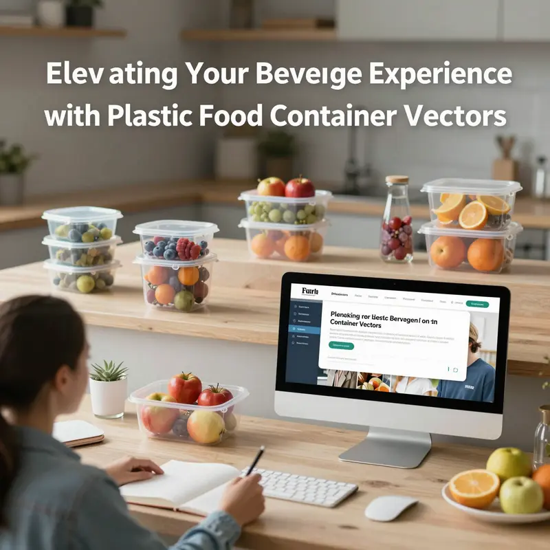
Vector graphics have become more than a technical shorthand for digital art; they are a language that translates physical form into scalable, adaptable visuals. In the realm of plastic food containers, vectors function as diagnostic tools and creative engines alike. They allow designers, marketers, educators, and researchers to explore how a container’s geometry, lid system, and labeling communicate function, sustainability, and safety at a glance. A well-crafted vector can render a translucent PET bottle or a sturdy HDPE tub with the precision needed for packaging mockups while preserving the flexibility required for rapid iteration. These half-planes of color, opacity, and line weight offer a controlled, repeatable means to demonstrate how a container might perform in real world conditions, from stacking efficiency to consumer handling. In practice, the job of a plastic container vector extends beyond mere aesthetics; it embodies a scaffold for projecting complex material properties, manufacturing constraints, and lifecycle considerations onto an accessible, shareable image. The result is a visual toolkit that supports decisions across product variants, display formats, and educational contexts without being tethered to a single physical specimen.
Designers working with plastic food container vectors often lean into a balance between clarity and nuance. Side views, transparent or semi-transparent fills, and visible lid mechanisms provide an immediate sense of scale and usage. A lid that hinges, threads onto a neck, or snaps into a groove conveys information about resealability and user convenience. Visual tricks such as slight translucency simulate the look of actual plastic while signaling content visibility, a feature that matters in both packaging and education about portion sizing. When designers incorporate content peeking—the depiction of fruits, grains, or other foods inside—the vector communicates purpose and recommended use without resorting to photography. This choice also matters for accessibility, where high-contrast outlines and distinct interior coloring help convey information to a broad range of viewers.
The array of vector techniques available—from flat design to isometric arrangements and even stylized 3D renderings—gives practitioners a spectrum of rendering options. Flat designs emphasize print and digital simplicity, ideal for labels, icons, and marketing banners. Isometric views imply depth and 3D form while maintaining crisp edge definition that scales cleanly. Integrated lighting and soft shading in 3D-rendered vectors can add realism without sacrificing the advantages of vector scalability. Layering is a practical principle here: designers stack color, texture, and opacity layers so that a single file can be tweaked to reflect different materials, capacities, or lid styles. This layered approach also supports content swaps—replacing a label with a new nutrition panel or swapping contents to demonstrate portioning—without a full redraw. AI-assisted tools are accelerating this workflow, enabling rapid generation of variations that reflect different sizes, shapes, or material cues, while still preserving a consistent design language across a library of vectors.
Behind these visual choices lies a grounded relationship with real-world materials. The vectors echo the material families that populate kitchen shelves and recycling streams: PET, HDPE, PP, PS, and bioplastics such as PLA. Each material carries distinct visual signatures that designers translate into color, transparency, and surface treatment cues within the vector. PET’s clarity and lightness can be represented by almost invisible edges and subtle highlights, suggesting a transparent, high-clarity container. HDPE can be conveyed through a more opaque body with slightly matte shading to imply rigidity, while PP’s durability and microwave-safe identity might be suggested with a smooth, resilient outline and a robust lid geometry. PS, often found in disposable ware, can be depicted with a stiffer silhouette and straightforward labeling to imply economical manufacturing. Bioplastics, as a sustainability narrative, prompt designers to introduce natural textures or soft green tones that hint at compostability while remaining visually neutral enough for broad educational use. These material cues in vector form are not literal substitutions; they are design languages that communicate behavior, performance, and end-of-life considerations without the need to see actual plastic particles.
The representation of manufacturing processes also threads through vector work. Injection molding leaves telltale features like mold seams, precise edge finishes, and replicable interior corners. Blow molding imparts smooth, continuous curves with hollow exteriors, often seen in bottle shapes and rounded containers. Extrusion-based sheet stock informs flat, uniform sides and the potential for seamless lids. In vector art, such manufacturing truths can be subtly encoded as embossed-like lines, seam indicators, or lid-lock geometries. These signals help students, procurement teams, and design practitioners reason about tolerances, assembly, and quality control long before a physical prototype is produced. In educational contexts, these graphical cues become a visual vocabulary that teaches the lifecycle of a container—from design constraints to mass production and, ultimately, recycling pathways.
Applications of plastic container vectors span a broad landscape. In packaging design, they serve as conceptual blueprints for new product lines, enabling quick exploration of form-factor variants, lid configurations, and labeling strategies. In marketing and advertising, vectors populate digital catalogs, social media visuals, and e-commerce pages with clean, scalable imagery that can be resized without loss of fidelity. Educational contexts find these vectors invaluable for teaching material science and sustainability concepts. They can demonstrate how recycling streams work, compare barrier properties of different polymers, or illustrate safe heating and storage practices without relying on static photographs. In software and app development, vectors populate interfaces that handle meal planning, inventory management, or nutritional guidance, maintaining visual consistency as products scale across platforms.
The practical relevance of these visuals extends into logistical and supply-chain storytelling. Vectors can simulate container configurations for pallets, transport stability, and stacking efficiency, aiding logistics planners as they visualize packaging tiers and loading patterns. In this sense, the vector becomes a bridge between design intent and operational feasibility. The availability of rich vector libraries—covering a spectrum of shapes, lid styles, labeling options, and content indicators—enables teams to assemble compelling, data-informed visuals that support decision-making at multiple levels of an organization. While the literature on the topic of plastic container vectors is sparse in explicit scholarly terms, the growing repositories and design tooling around vector art reflect a broader trend: the translation of physical packaging realities into flexible, scalable digital representations that can educate, persuade, and inform.
This convergence of design practice and educational utility also raises important conversations about sustainability and responsible representation. Vectors offer a controlled way to depict eco-friendly narratives, such as containers designed for recyclability, reuse, or compostability. They enable quick visualization of alternative materials, interior content, and labeling that communicates safety and disposal information. Yet the clean lines of vector art can risk oversimplifying real-world complexities, particularly around chemical leaching, migration, and the nuanced performance of materials under heat and stress. Designers must balance clarity with honesty, using texture and shading to convey material properties without misrepresenting their capabilities. In education, this balance translates into guided visuals that accompany explanations of material science, regulatory considerations, and environmental impact—tools that help learners distinguish between packaging claims and verified behavior. The result is a more informed audience that can interpret visuals as gateways to deeper inquiry rather than final verdicts.
As the field evolves, the future of plastic container vectors points toward a more immersive design language. The language of texture—subtle grain, soft reflections, and tactile cues—will gain prominence to evoke natural materials without abandoning the efficiency of digital rendering. Interactive SVGs and responsive vector models will enable viewers to manipulate lid types, content visibility, and labeling in real time, deepening engagement with packaging concepts. AI-assisted generation will continue to diversify style families, ensuring designers can tailor vectors to audience, application, and disciplinary context. At the same time, the sustainability narrative will grow more nuanced, inviting vectors to reflect life-cycle assessments, recyclability metrics, and end-of-life scenarios through adjustable parameters and transparent annotations. In classrooms, museums, and design studios, these evolving vectors can become living diagrams—tools that invite experimentation, support critical thinking about material choices, and illustrate how form follows function in a world increasingly oriented toward responsible consumption.
The interplay between real-world materials and their vector representations is more than a technical transfer. It is a cognitive bridge that helps people visualize how packaging decisions translate into consumer experience, manufacturability, and environmental outcomes. In classrooms, it is a scaffold for explaining polymer properties, processing methods, and the practical implications of design choices. In industry, it supports rapid prototyping, marketing storytelling, and educational outreach, underscoring the role of visuals as a strategic asset rather than a mere aesthetic add-on. As libraries expand and tools become more capable, plastic food container vectors will continue to grow as a shared language—one that distills complex material science and packaging logistics into accessible, scalable visuals that empower better decisions across the value chain. The trajectory is not merely about prettier pictures; it is about clearer thinking, safer design, and more informed dialogue about how packaging shapes everyday life.
Internal reference: In practice, designers frequently draw from a broad spectrum of vector resources that include eco-friendly and alternative-packaging concepts. For readers seeking tangible examples of packaging visuals tied to sustainable materials, a relevant resource in our content library offers a detailed look at kraft-based containers and their user-facing designs. You can explore a specific example here: senang kraft-paper-octagonal-bowl-1200ml-waterproof-eco-friendly-disposable-salad-bowl-for-snack-cookie-warm-cold-food-pet-lid. This reference demonstrates how a single form factor can be adapted across contexts while preserving legibility and functionality in vector form.
External reference for further study: https://www.vecteezy.com/vector-art/plastic-food-container
Visual Vectors, Real Impacts: Sustainability and Storytelling in Plastic Food Container Graphics
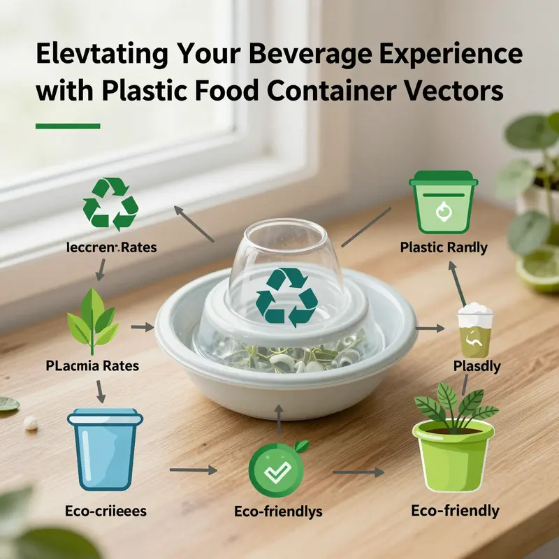
Vectors are more than pretty diagrams. They are a bridge between design intention and physical reality, a language through which designers translate the complexities of plastic food containers into scalable, shareable visuals. In the context of sustainability, these visuals do double duty: they communicate what a container is made of, how it behaves in use, and, crucially, what its end of life might mean for ecosystems and communities. The modern vector library is not merely a gallery of shapes. It is a repository of decisions—material choices suggested by glosses of transparency, thickness, and color; manufacturing cues implied by mold seams, lid mechanisms, and embossed logos; and usage scenarios that hint at recyclability, reuse, or disposal. As the digital age pushes for more accurate, accessible storytelling, the environmental footprint of plastic food containers becomes a focal point for designers who want their vectors to educate as well as entice. They can show the gleam of PET’s clarity or the sturdiness of HDPE’s opacity; they can depict the snap of a polypropylene lid or the brittleness of a styrenic shell, all while shaping a viewer’s understanding of what each material means for waste streams, resource use, and human health. The interplay between visuals and material science matters because visuals do not merely illustrate; they normalize. When a vector communicates a product’s try-before-you-buy promise, it also sets up expectations about its lifecycle. If the graphic leans toward glassy transparency or natural textures that mimic reusable vessels, audiences may infer a longer use phase, cleaner recycling, or more responsible disposal. These inferences become powerful levers for behavior, particularly when the same images circulate across packaging design, marketing, and educational content.
From a materials perspective, the most common real-world substances behind plastic containers—PET, HDPE, PP, PS, and increasingly bioplastics like PLA—offer a spectrum of performance and end-of-life profiles. PET provides clarity and lightness, a look that vectors can render with transparent gradients and crisp highlight reflections. HDPE contributes opacity and chemical resistance, which vectors often communicate through solid fills and subtle matte textures. PP lends durability and microwave safety, something a designer can imply with rounded forms and reinforced seams. PS, widely used for disposables, invites a more temporary, inexpensive aesthetic. Bioplastics bring a future-forward note, but their real-world compostability hinges on specific facilities and conditions that are rarely guaranteed in everyday settings. In vector form, these differences can be dramatized without sacrificing clarity: a line of clean, simple silhouettes can still convey the idea of a material’s resilience, its recyclability, or its compatibility with heat. The underlying message matters as much as the shape itself.
Beyond the surface aesthetics, the manufacturing lineage embedded in these shapes—whether injection molding, blow molding, or extrusion—offers visual cues that help designers tell a more informative story. Mold seams, for instance, hint at molding processes and mass production realities, while embossed logos or team-part numbers suggest branding and regulatory considerations. A container’s form in a vector can subtly reflect the trade-offs that come with scale: precise, high-precision injection molding for dense, intricate geometries versus the hollow, rounded forms typical of blow-molded bottles. Such cues are valuable for viewers who are trying to understand not just what a container looks like, but how it is made, why that matters for waste and energy use, and what design choices could improve its overall environmental performance. The capability to layer these elements—color, texture, labels, even content swaps—means designers can rapidly test messaging about recyclability, reuse, or compostability while maintaining the fidelity needed for packaging mockups, marketing visuals, or classroom demonstrations.
In parallel with design technique, the environmental implications of plastic containers loom large. The research landscape emphasizes that single-use plastics, including many disposable containers, contribute substantially to waste and pollution. The concern extends to microplastics that pervade soil and water and, increasingly, the human body through food and drinking water. BPA and phthalates, common additives, raise health questions when heated or recycled into new products. The recycling picture remains disheartening: guideline estimates frequently cite that less than 9% of all plastic ever produced has been recycled, with the vast majority ending in landfills, incineration, or natural ecosystems. These realities beg a careful design stance. If vectors can demonstrate reuse scenarios or encourage viewers to consider end-of-life options, they become tools for reducing waste instead of merely decorative assets. The broader lifecycle picture suggests that packaging accounts for a portion, often cited as under 10% of total life cycle emissions for many food products; yet the cumulative impact—a chain of energy use, emissions, and ecosystem effects—extends well beyond a single product. Visual storytelling that foregrounds these connections can help people grasp that the cost of convenience is not limited to price at checkout but includes environmental and public health dimensions across time.
One of the most persuasive strategies in vector storytelling is the careful juxtaposition of convenience with sustainability. Designers can, through color palettes, textures, and proportions, hint at the balance between usability and responsibility. A container drawn with a glassy, transparent body and a recyclable-symbol cue communicates a hope for cleaner material streams, while a robust, opaque shell with a visible reusable-suffix might suggest durability and long life. The emerging design language also embraces natural textures—soft wood grains, matte śurfaces, and subtle fabric-inspired patterns—to evoke a sense of stewardship and care. This shift toward sustainability-centric visuals aligns with broader trends in packaging and digital media, where eco-conscious messaging increasingly shapes consumer expectations and corporate practice alike. Importantly, the ability to create interactive SVGs offers new pathways for engagement: viewers can toggle between use-phase scenarios, observe how washing and reuse alter a container’s environmental profile, or compare end-of-life outcomes across materials. Such interactivity makes the vector a living educational tool, not a static illustration.
As the field expands, AI-assisted vector generation accelerates the process of testing ideas. Designers can generate variations—different lid designs, different translucencies, alternative recycling icons—within moments, enabling rapid exploration of how subtle changes influence perceived sustainability. The capacity to customize properties, simulate realistic shading, and adjust textures helps ensure that the visuals strike the right balance between accuracy and accessibility. This capability is not just about aesthetic efficiency; it enhances the opportunity to convey complex science in digestible form. In this sense, vectors become a pedagogy, teaching viewers to recognize what makes a container environmentally preferable, even if their day-to-day choices remain nuanced and context-dependent.
To illustrate how real-world packaging imagery can align with responsible messaging, consider a tangible example of an in-stock Kraft-paper octagonal box with a lid. While this is a concrete product category in the physical world, its vector representation can be a powerful narrative device in sustainability discussions. For designers seeking precise references, an in-stock Kraft-paper octagonal box with lid offers a concrete template for communicating recyclability, versatility, and compostability narratives within a single flexible graphic. an in-stock Kraft-paper octagonal box with lid example demonstrates how a simple shape can carry multifaceted messages: the natural texture of kraft signals responsibility; the boxy geometry conveys durability; the lid implies containment and reuse potential. By linking such visuals to broader lifecycle concepts, designers reinforce the idea that even everyday shapes can contribute meaningfully to conversations about waste reduction and material responsibility.
The chapter’s thread weaves together material realities, manufacturing heritage, health considerations, and the storytelling power of vectors. It recognizes that while vector art cannot by itself transform recycling infrastructure or consumer habits, it can shape the discourse and foster more informed decision-making. Designers can steer toward imagery that emphasizes reuse, invites critical reflection on heating and disposal, and showcases alternative materials without sacrificing clarity or appeal. The shift toward sustainable design language—textures that evoke nature, imagery that foregrounds circularity, and interactive formats that reveal lifecycle trade-offs—reflects a collective aspiration: to align visual communication with responsible production, safe consumption, and feasible end-of-life solutions. In practice, this means expanding vector libraries beyond glossy, single-use aesthetics toward assets that communicate durability, reusability, and environmental sensitivity with honesty and nuance. When viewers encounter these visuals across packaging design, marketing, education, and digital applications, they encounter a more coherent message: that the most effective plastic food containers are those that minimize harm to ecosystems while maintaining the benefits of safety, convenience, and accessibility.
For further reading on the environmental performance of plastic food packaging, including life cycle assessments and marine ecosystem considerations, a detailed scientific analysis is available externally. It provides a rigorous counterpoint to design rhetoric and helps ground visual storytelling in empirical data: https://www.sciencedirect.com/science/article/pii/S095605421930275X
Beyond the Mold: Visual Futures in Plastic Food Container Vector Design
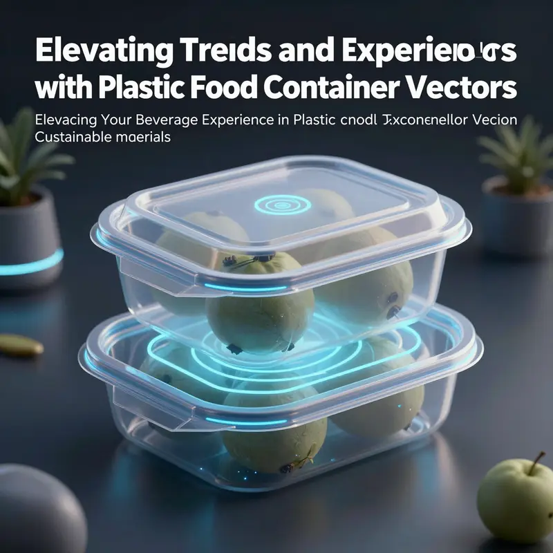
The future of plastic food container vector design unfolds as a tightly woven dialogue between material reality and digital imagination. Designers stand at a pivot where the look of a container on screen must carry the evidence of real-world use while whispering about a gentler, more circular economy. The vector is no longer a flat surface but a window into processes, possibilities, and responsibilities. In this evolving landscape, the visual language shifts from simply depicting a product to telling a story about sustainability, usability, and safety. Each line, shade, and contour is a choice that shapes perception and behavior across packaging, marketing, and education, all without losing the crisp scalability that vector graphics guarantee across platforms and formats.
Sustainability threads through every decision in vector design even when that intention is not immediately legible to the eye. A minimalist aesthetic with high-contrast translucency can emphasize product visibility while signaling a commitment to reduced material ambiguity. Designers increasingly favor clean silhouettes that hint at recyclable, single-material construction or at least a design that reads as non-obtrusive in recycling streams. The beauty of a well-made vector lies in its ability to simulate textures and transparencies without sacrificing file size or rendering speed. It enables a brand to communicate a forward-looking stance—stackable forms, interlocking rims, and modular geometry—that promises efficiency in shipping and storage as well as ease of disposal when the lifecycle ends.
At the core of these shifts is the rapid adoption of advanced digital tools. Artificial intelligence and machine learning-assisted workflows now help generate multiple design iterations from a single prompt, allowing teams to experiment with shape language, lid mechanisms, and label placement in a matter of minutes rather than days. High-resolution 3D mockups bring a new depth to concept reviews, letting stakeholders rotate, light, and texture the imagined product with photorealistic fidelity. The result is a more iterative, responsive design process where sustainability metrics, brand guidelines, and consumer insights converge in real time. The reach of such tools extends beyond marketing visuals; they underwrite educational content and app-driven experiences that teach portion control, portioning accuracy, and waste reduction.
Yet as the visuals become more sophisticated, hygienic design principles begin to shape how vector assets are authored. Digital representations must reflect safety concerns about food contact surfaces, decontamination, and surface finish. Designers now model smoother, non-porous textures that imply ease of cleaning and resistance to microbial buildup, while also indexing surfaces with subtle microtextures that suggest grip and usability without creating fussy, high-friction textures that would be impractical in real-world production. The best vectors strike a balance: they convey the practical realities of cleanability and food safety while remaining legible at small sizes across e-commerce thumbnails, app icons, and instructional infographics. The aim is not to imitate every mold line but to evoke confidence through accurate cues—rounded rims for stacking, clearly defined seals, and uncluttered panels where labels can live without distortion.
In practice, designers increasingly treat vectors as a living library rather than a single, isolated artwork. Layered structures within vector files enable easy customization of color schemes, label text, and content swaps. This modular approach aligns with the needs of brands experimenting with new lines or limited editions that emphasize eco-friendly materials, microwave safety, or portion-controlled packaging. It also supports educational content that demonstrates how packaging choices influence waste streams, recyclability, and consumer behavior. The library mindset ensures consistency across campaigns while preserving the flexibility to adapt to new regulatory requirements or shifting consumer preferences. The result is a dynamic ecosystem where form and function evolve in tandem with environmental and social considerations.
An emerging trend in the field is how designers translate real-world manufacturing cues into digital cues. Injection molding, blow molding, and extrusion leave recognizable footprints—mold seams, embossed logos, layer textures, and ring patterns—that can be stylized for vector renditions without implying a misleading level of production detail. Interlocking rims and stackable geometries, common in many contemporary containers, are particularly fertile ground for vector exploration. They offer a clear, intuitive visual language that communicates durability and space efficiency. As designers craft these shapes, they inevitably run into tradeoffs between printability, digital fidelity, and user perception. The challenge is to preserve the sense of material integrity—what a container would feel like if held in hand—while ensuring that the artwork remains crisp when scaled down for a label or scaled up for a billboard.
Within this milieu, several practical strands are taking stronger hold. One is the rise of natural textures and color palettes that evoke sustainability without resorting to clichés. Subtle grain, matte finishes, and soft glosses can imply bioplastic or recycled content without forcing a literal material translation. Designers also experiment with color systems that communicate recyclability or reusability through intuitive cues—contrast to indicate reusable sections, or a palette that nudges viewers toward environmentally responsible choices. These decisions are not merely aesthetic; they influence how quickly a consumer recognizes a product’s end-of-life path, a factor increasingly linked to purchase decisions in eco-aware markets.
Another significant thread concerns the storytelling capacity of vector assets. The best designs tell a story about how a container fits into daily life: how it stacks, how it seals, how it travels from pantry to microwave to recycling bin. Educational overlays—simplified diagrams, proportion cues, and portions charts—live alongside the main container visuals. They help convey practical messages about portion control, storage efficacy, and waste minimization. The digital flexibility of vectors makes it easier to swap content, edit labels for different languages, or adjust measurements for various capacities. In an era where packaging must perform across formats—from social media memes to educational apps—the ability to repurpose a single vector across contexts is not just efficient; it’s essential.
The role of resource platforms in shaping these futures cannot be understated. Designers turn to asset libraries to accelerate innovation, test new ideas, and maintain consistency across campaigns. A carefully curated set of vector assets can offer photorealistic 3D mockups, isolated parts, and scalable configurations that align with sustainability goals. Such resources help teams prototype novel concepts—like containers designed for interlocking stacking or for optimized palletization—without sacrificing accuracy or introducing expensive production mistakes. As ideas move from conception to client review, the ability to preview a concept in multiple lighting scenarios, angles, and finishes becomes a decisive factor in advancing a project. This is a practical bridge between creative ambition and real-world feasibility.
For design teams seeking concrete direction, one internal reference demonstrates how environmentally conscious packaging concepts can be visually realized in vector form. factory-direct eco-friendly kraft packaging bowl illustrates how a simple, sturdy form can be translated into a scalable, reusable graphic. It shows how a single, clean geometry can be adapted to convey different liter capacities, lid configurations, and labeling needs, all while maintaining a consistent silhouette that supports efficient production and distribution workflows. This kind of asset serves as a touchstone for teams exploring new lines or refining a brand’s sustainable storytelling through vector visuals. It is not a product pitch but a visual anchor that anchors design decisions to practical, real-world constraints.
As the field advances, a few key features are emerging as indicators of futures that designers are actively pursuing. Sustainable materials in digital imagination—reflecting real options such as post-consumer recycled content, plant-based blends, and compostable substitutes—are being imagined through light, transparent surfaces and organic curves that still deliver crisp geometry. Rounded, interlocking rims gain popularity because they hint at stable stacking without implying weight or bulk. This is a direct response to transport efficiency and shelf-space optimization. In parallel, there is an intensifying interest in hygiene-forward aesthetics: out of the gate, surfaces appear easy to clean, with simple curves and seamless joins implied by the vector’s shading and highlights. These cues reassured stakeholders that the concept respects safety and maintenance as much as form.
The broader cultural context also shapes how vectors are crafted. Consumers increasingly expect packaging graphics to explain sustainability without overwhelming information overload. Designers respond with scalable, legible visuals that can adapt to a range of literacy levels and languages. This often means prioritizing visual hierarchies that emphasize recyclability icons, single-material cues, and intuitive usage diagrams. The digital canvas supports experimentation with gradients and translucencies that suggest careful material choices while remaining faithful to the constraints of production inks, screen displays, and print processes. In other words, the vector becomes a translator—between material science, consumer behavior, and the realities of logistics and marketing.
No discussion of the near future would be complete without acknowledging how rapidly evolving software ecosystems shape what is possible. Generative tools, parametric design features, and cloud-based collaboration allow teams to converge on a shared vision quickly. They reduce misalignments between designers, engineers, and marketers. Importantly, these tools also lower the barrier to exploring more ambitious packaging concepts—like modular containers that can morph into different configurations, or graphics that react to user inputs in interactive SVGs for online education platforms. The result is a more resilient creative process, one that can respond to policy shifts, supply chain disruptions, and evolving consumer expectations with agility and clarity.
From a strategic standpoint, the trajectory of plastic container vector design points toward a more explicit integration of lifecycle thinking. Designers will increasingly model how graphics signal end-of-life options at a glance, making it easier for consumers to separate materials correctly. They will also depict design-for-recycling cues that help the recycling stream work as intended, even when mixed materials or coatings are involved. This alignment supports a broader push toward circular packaging systems, where digital art acts as a beacon for responsible consumption and production. In this sense, the vector is not a decorative afterthought but a functional tool for sustainability literacy—teaching, guiding, and inviting responsible action through visuals that are as accessible as they are precise.
In sum, the coming era of plastic food container vector design is defined by a symbiotic relationship between material authenticity, digital ingenuity, and social responsibility. It is a field energized by sustainability goals, buoyed by advances in AI and 3D visualization, and grounded in hygienic and practical design principles. The visuals we create will do more than decorate a product; they will help people understand how packaging works, why certain choices matter, and how design can contribute to a cleaner, safer, more efficient food system. As this ecosystem evolves, designers will continue to experiment with texture, form, and behavior, harnessing the power of scalable vectors to shape a future where packaging is not only seen but understood—and where every pixel nudges us toward better choices for the planet.
External reference: https://www.creativemarket.com/graphics/realistic-plastic-food-container-128675
Final thoughts
Navigating the world of plastic food container vectors offers exciting opportunities to enhance branding and sustainability in the beverage industry. With compelling designs that appeal to consumers and an understanding of the materials and processes that make these containers effective, businesses can leverage vector graphics to elevate their branding and service experience. As the conversation around sustainability grows, incorporating environmentally conscious strategies into your packaging design will not only resonate positively with customers but will also align your business with essential future trends. Embrace the possibilities that plastic food container vectors offer and position your brand for success in a competitive market.