

In today’s competitive food service landscape, the importance of visual presentation cannot be overstated. Disposable food container images play an essential role in attracting customers and influencing their purchasing decisions. For bubble tea shops, restaurants, food trucks, catering services, event planners, and corporate procurement teams, understanding the nuances of disposable food container imagery can lead to improved marketability and brand loyalty. This comprehensive guide delves into high-resolution images, the trend towards eco-friendly packaging, material variations, consumer behavior, and cultural preferences—all crucial aspects for optimizing your disposable packaging strategy.
Through the Lens: High-Resolution Imagery and the Trustworthy Presentation of Disposable Food Containers
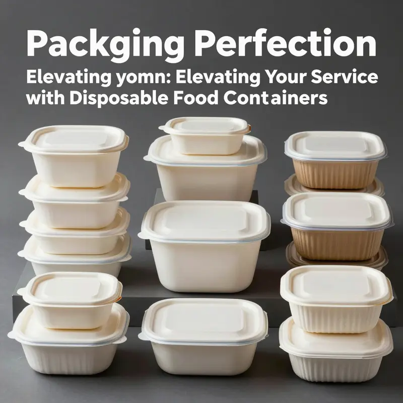
Images in the online marketplace do more than illustrate a product; they scaffold trust, expectation, and purchase intent. In the realm of disposable food containers, high-resolution imagery becomes a surrogate for physical inspection, translating tactile cues and functional promises into visual evidence. Viewers need to discern not only what the container looks like but how it behaves under real use. A crisp photograph can reveal the heft of the material, the precision of the lid seal, and the flatness of the profile, all of which signal durability and reliability. When the image is sharp enough to notice edge finishes, seam integrity, and the interior capacity, a buyer gains confidence that the container will perform during takeout, catering, or meal prep. This is especially important in a market crowded with options that differ primarily in material choices and design details. The image becomes the first and most tangible descriptor of value, shaping how a consumer weighs convenience against sustainability and cost against performance.
Material quality is among the most legible signals in high-resolution photography. Containers crafted from heat-resistant plastics disclose their practical advantages through clear renderings of wall thickness, translucence, and edge geometry. In images that convey a container’s ability to withstand microwave or oven use, subtle cues such as uniform color, minimal warping along the base, and consistent lid fit reassure potential buyers about safety and practicality. Conversely, when the choice is a biodegradable alternative composed of pulp or bagasse, texture becomes a key communicative feature. Photographs that reveal the natural grain, fibrous texture, and matte finish of a compostable material help consumers understand not only aesthetics but also environmental provenance. These visual details matter because they address a spectrum of consumer questions—from odor retention and moisture management to compostability and end-of-life considerations.
Design features seize attention through careful composition. The most effective images highlight the lid’s mechanism, the container’s flat silhouette, and the generous interior that accommodates a complete meal or a full-service catering portion. Close-ups of the lid groove, the sealing rim, and the interior corners illustrate how the design mitigates spills and preserves presentation. In takeaway scenarios, the visual narrative often centers on compatibility with sleeves, sleeves’ anti-slip textures, and the ease of stacking for efficient transport. When a photograph captures multiple angles—top, side, underside, and a cross-sectional view—it communicates a holistic sense of how the container performs in practice. Such imagery reduces uncertainty and supports a buyer in imagining the product in use, whether in a fast-casual setting, a school cafeteria, or a corporate event.
Across categories, imagery also signals sustainability without compromising clarity. Biodegradable or compostable options are most convincing when the textures and color tones reflect their natural character, rather than a sterile, plastic-like gleam. Effective visuals may show the pulp fibers’ irregularities, the warmth of the material, and the absence of glossy coatings that would imply nonbiodegradability. In contrast, traditional plastic containers often rely on clean lines and crisp reflections to imply durability and reusability. The contrast between these looks—natural versus polished—helps consumers map their values onto the product, aligning choice with personal or organizational commitments to waste reduction and responsible sourcing.
The role of imagery extends beyond consumer storefronts into professional procurement and bulk ordering. In commercial contexts, clear, professional images are essential for translating specifications into tangible expectations. When buyers evaluate large lots, they rely on visuals that communicate not only dimension and capacity but also practical realities like lid security, stackability, and compatibility with automated handling systems. Detailed photography that includes scale references and close-ups of sealing mechanisms provides a trustworthy basis for negotiating contracts, planning menus, and forecasting storage needs. It is not enough for a container to look right; the image must demonstrate how it behaves under the pressures of high-volume feeding, rapid turnover, and diverse service environments.
Organic and eco-friendly trends are reinforced by imagery that respects the material narrative. For pulp and bagasse alternatives, images that reveal the texture, natural tint, and porosity help convey compostability and the absence of harsh chemical coatings. Such visuals can also reflect practical usage cues—how a vessel performs with sauces, oils, or moisture-rich foods—while maintaining a perception of environmental responsibility. The interplay between sustainability and functionality in the photographic language guides buyers toward choices that balance operational needs with stewardship goals. In this sense, the photograph becomes a storytelling device that aligns product capability with broader values, a convergence that increasingly drives brand loyalty and category leadership.
Within the creative economy of online catalogs, one emblematic example of versatile visual communication centers on the kraft-paper series of disposable containers. Consider the kraft-paper octagonal bowl with a lid, a form that embodies portability, packaging integrity, and adaptability for snacks, salads, and light meals. The image set for such a vessel typically includes multiple angles, a clear view of the lid seal, and a light, natural color palette that underscores the material’s eco-friendly credentials. These visuals collaborate with detailed specifications to convey a complete narrative: durable construction, heat tolerance where relevant, and a design that minimizes leakage while preserving presentation. For readers seeking a concrete reference to similar packaging visuals, a representative example can be explored here: Kraft-paper octagonal bowls with lids.
The visual language also serves as a bridge between manufacturers, suppliers, and marketplaces. In platforms that handle bulk orders, the demand for precision in imagery becomes a practical constraint and an opportunity. Sharp, well-lit imagery reduces the friction of inquiry, enabling buyers to quickly discern whether a container meets requirements for size, weight, stacking height, and lid engagement. The best product photos incorporate not only the main shot but also close-ups of material seams, sealing surfaces, and any embossed labeling or branding marks that affect both aesthetics and traceability. When such elements are visible with fidelity, they give confidence that technical specifications align with on-site performance, a crucial assurance in procurement decisions that involve large quantities and strict quality controls.
To understand how image fidelity translates into perceived value, it helps to look at the broader arc of packaging presentation. Across the spectrum—from traditional plastics to more sustainable pulp-based options—high-resolution imagery is not merely ornamental. It is a strategic instrument that communicates value, reliability, and innovation. The strongest visuals tell a story of how a container can meet the demands of busy kitchens, while also aligning with consumer expectations for responsible packaging. They invite viewers to envision real-world use, to trust the product’s claims about safety and convenience, and to believe in the consistency of performance across orders and applications. In this sense, imagery becomes both evidence and counsel, guiding decisions in a marketplace where choices multiply and margins tighten.
External resource: for further exploration of photography standards in this domain, refer to the guidelines provided by a major retailer’s packaging visual documentation. The linked material offers a detailed look at how high-resolution images should reveal material quality, seal integrity, and real-world usage scenarios, reinforcing the points discussed here. External photography guidelines reference.
Visible Sustainability: The Power of Imagery in Eco-Conscious Disposable Food Containers
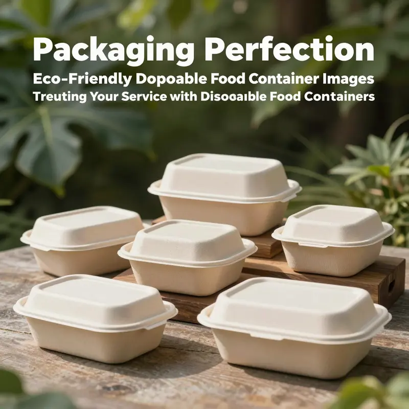
In the online marketplace, images do more than showcase form; they invite trust. For disposable food containers, the visual language communicates not only size and fit but a set of values about how food is packaged, transported, and disposed of. Visual representations become the first conversation between a consumer and a product, especially when a purchase happens without the tactile reassurance of a store shelf. The research materials on disposable container imagery highlight a simple yet potent truth: image quality and content actively shape what buyers believe about a container’s practicality and its environmental footprint. High-resolution shots that reveal texture, color, and construction convey information that text alone cannot. A close-up of a natural fiber surface, a subtle matte finish, or a clear window that previews the interior all serve as cues about durability, cleanliness, and eco credentials. The best images do more than show a container; they tell a story about how it can fit into a sustainable workflow, from kitchen prep to consumer takeaway.
The material story is particularly visible in imagery. Across the global market, there is a noticeable shift toward plant-based options that promise biodegradability or compostability. Bamboo, bagasse from sugarcane, cornstarch-based PLA, and wheat straw are increasingly represented in product photography. These materials are celebrated not only for their reduced reliance on petroleum-based plastics but for the textures and tones they bring to imagery. A bamboo or bagasse container photographed at natural light often reveals warm fibers and irregular grain that suggest authenticity and a lower environmental impact. Images of PLA-coated or bagasse-based trays can emphasize translucency or matte surfaces that suggest a different kind of barrier protection. In this visual language, the container’s material becomes legible through texture, color, and finish.
Design choices that favor minimalism and nature-inspired aesthetics also translate powerfully on camera. Clean lines, subdued earth tones, and restrained branding appear more frequently in product shoots, because they align with consumer expectations of sustainability. A simple, unembellished lid paired with a plain base communicates a no-nonsense approach to packaging, while subtle details—like a gentle embossing, a soft-lilt edge, or a natural fiber interior lining—signal care and thoughtfulness. The palette in these images tends toward off-whites, soft browns, greens, and muted blues, echoing themes of earth and water. In photography, these color choices help the viewer read the container as part of a broader system—one that values renewable materials, responsible sourcing, and lower environmental impact. Clear labeling in the imagery also matters. When a shot includes legible icons or text about compostability, certification, or recycled content, it reduces ambiguity and builds consumer confidence. The visual language becomes a shorthand for sustainability, translating technical facts into instantly recognizable cues.
The research points to another critical dimension of imagery: the way containers are framed and contextualized. Images that place a disposable container in real-world settings—catered events, street food stalls, or office lunchrooms—provide viewers with a practical sense of scale and use. Close-ups of the interior, the edge where lid meets body, and the stackability of multiple units convey more than specifications; they convey a usable life. High-angle shots, isometric views, and context-rich arrangements reveal how the container performs in busy service environments, where quick assembly, secure sealing, and clean presentation matter most. The ability to see a lid closed with a visible seal, a portion of the interior, and a glimpse of contents helps buyers assess suitability for soups, noodles, salads, or desserts.
Crucially, the authenticity of imagery matters as much as its aesthetics. The materials and processes behind disposable containers are increasingly standardized around credible, traceable sourcing and transparent production. As the research notes, imagery drawn from reputable manufacturers—images that honestly reflect material composition and the container’s construction—helps build trust in the marketplace. When photos show a realistic thickness, a visible seam, or a transparent view into the sleeve or lid mechanism, buyers perceive the image as truthful. This trust is essential in a sector where sustainability claims can be controversial. Visual integrity reduces perceived risk and supports informed decision-making.
In practice, this visual integrity is reinforced by the integration of branding and eco-labels within images. A visually coherent shoot that pairs the container with eco-conscious branding elements—logo marks, color palettes that echo natural materials, and clear, legible sustainability statements—helps convey a consistent story from listing to purchase. For example, a catalog image set that combines a product shot with branding and a clearly marked eco-label provides a concise snapshot of both function and responsibility. The following example illustrates how imagery and branding can reinforce trust: senang01-custom-logo-eco-friendly-disposable-matt-lamination-brown-kraft-catering-takeaway-sushi-food-box. This kind of presentation makes the eco narrative tangible, without overwhelming the viewer with technical jargon. It also demonstrates how an image set can support a cohesive product story across multiple SKUs and sizes.
A significant challenge in disposable container imagery is balancing environmental cues with practical clarity. Consumers want to know that a container will hold hot or cold foods, maintain moisture control, and fit into their service workflow. Images that compress these practical considerations into visual signals—such as a close look at a heat-resistant lip, the presence of a leak-proof lid, or the way a container nests with others for efficient storage—help translate environmental benefits into day-to-day value. The photography must avoid overpromising; it should present a realistic, usable product. The best image sets accomplish this by offering multiple angles and context options in a single gallery: a product on its own, a lid-on shot, a side profile to show thickness, an open view to reveal interior dimensions, and a scene shot demonstrating the container in a serving setting.
This is where the broader visual ecosystem around sustainable packaging becomes important. Visuals are not created in isolation but merged with industry insights and design conventions. For designers and marketers, the ongoing shifts toward plant-based materials and minimal aesthetics provide a roadmap for camera angles, lighting, and styling. The aim is to present a believable, aspirational yet practical image that communicates both the ecological rationale and the everyday utility of the product. The visuals should invite viewers to imagine how the container supports efficient service, reduces waste, and aligns with brand values around sustainability. In this sense, imagery becomes a bridge between material science and consumer behavior, linking the chemical reality of a bagasse tray with the consumer’s sense of responsibility and everyday convenience.
As trends continue to evolve, the role of imagery will expand to include more immersive and interactive experiences. 360-degree spins, close-up micro-photography that reveals fiber and coating details, and lifestyle setups that show the container in various catering environments will likely become standard. The emphasis will remain on honest representation, with a growing emphasis on clear labeling and accessible sustainability information embedded within the image metadata or companion notes. This alignment of visual storytelling with material truth is essential for sustaining consumer trust and fostering broader adoption of eco-friendly disposable packaging.
External resource: https://www.sustainablepackaging.org/resources/visual-trends-in-sustainable-packaging
Seeing Through the Cart: Material and Design Variations in Disposable Food Container Images
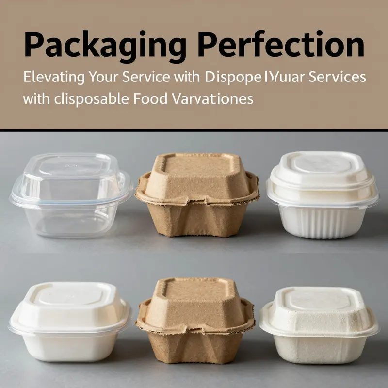
Images of disposable food containers do more than showcase a product; they craft a visual language that informs the viewer about material, function, and sustainability. In a crowded online marketplace, photography communicates texture, weight, heat resistance, and quality through lighting, angles, and context, while supporting text reinforces claims about recyclability or compostability. Different materials convey different signals: plastic variants like PET and PP often appear crisp and glassy, suggesting cleanliness and reliability; EPS foam can read as lightweight insulation with a matte, tactile shell; paperboard and biobased options emphasize earth friendliness with rustic textures and natural backdrops; CPET images balance clarity with strength and microwavability. Design variations such as multi-compartment trays, secure lids, and seal lines are highlighted to communicate portion control, leak protection, and user friendliness. Environmental and aesthetic trends link imagery to sustainability narratives, using scenes like farmers markets for paperboard or urban settings for plastic, while careful lighting and context establish whether a container is intended for takeout, catering, or home meal prep. High-quality imagery supports trust by showing real-world use, scale, and fit, and professionals often pair close-up textures with contextual shots to guide consumer expectations. For designers and marketers, the takeaway is to harmonize material truth with brand storytelling, ensuring that visuals reflect actual performance and environmental messaging. An external image resource often cited for visual vocabulary in this field is linked in product pages to support consistent imagery and comparison.
Seeing Value in a Single Frame: The Market Power of Disposable Food Container Images
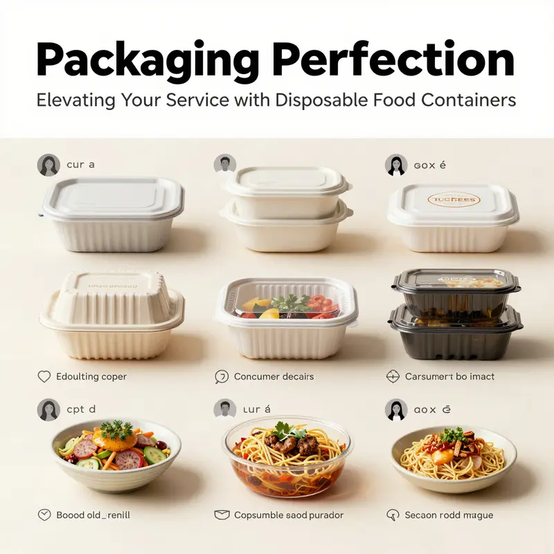
Images serve as the first measure of a disposable container’s worth in today’s online food economy. In a marketplace where buyers cannot physically touch a product until after purchase, the image becomes the product’s first ambassador. High-resolution visuals do more than show shape and color; they convey material cues, construction quality, and practical promises such as leak resistance, thermal efficiency, and portability. When a viewer scans a gallery of options, the frame-by-frame storytelling of a single image set can create an immediate sense of whether a container will keep curry intact during transit, whether a lid seals confidently, or whether a stackable design fits into a crowded kitchen rack. These images translate into perceived value, which in turn translates into purchase intent. The most effective imagery does not simply present a container; it frames the container as a reliable partner in feeding people, whether at home, in a café, or on the go.
A central thread in review of the visual materials from credible manufacturers is the emphasis on detail and realism. High-quality images often include multiple angles, close-ups of tight-sealing rims, and demonstrations of functional features such as microwave suitability or temperature retention. The value of a tight lid, for example, is not just a claim but a visible cue: a photo that isolates the lid’s edge, shows its gasket, or captures a lunch being carried by a hand helps the viewer infer how the product will perform under real-world conditions. In this way, the image ecosystem becomes a kind of online tactile experience, bridging the gap between aesthetic appeal and practical assurance. The imagery frequently combines lifestyle context with technical clarity, a combination that fosters confidence and reduces perceived risk in online purchases.
Beyond function, the images increasingly communicate sustainability as a design language. Visual storytelling now often juxtaposes the convenience of disposables with the responsibilities of eco-friendly materials. A close-up of a container made from biodegradable or compostable material, a product shot that highlights the absence of harmful additives, or a side-by-side comparison of traditional plastic versus greener options can shift consumer perception from seeing disposables as wasteful to viewing them as consciously chosen, low-impact options. The images that emphasize clean lines, natural textures, and subtle earth-toned palettes tend to align with consumer values around health, transparency, and environmental stewardship. This trend is not merely aesthetic; it translates into perceived brand integrity and loyalty, especially among shoppers who weigh environmental considerations alongside price and convenience.
The research also points to the power of contextual imagery. Real-life application scenes—such as a delivery service container keeping a curry warm during transit or a compact, stackable bowl supporting a quick, on-the-go meal—create relatable narratives that resonate emotionally. When viewers see a container pictured in a familiar setting, they picture themselves using it in their own lives. This imprint strengthens perceived usefulness and creates a sense of trust in the product’s practical benefits. It is a reminder that the function of a disposable container extends beyond the container itself; it intersects with the experience of feeding others, managing time, and reducing waste in everyday routines.
In this light, the role of imagery becomes strategic. As regulations tighten on single-use plastics and consumer awareness rises, the brands that invest in truthful, compelling visuals of durable, reusable, or biodegradable options gain a critical edge. Images that scrub away ambiguity and reveal the container’s strengths—tight seals, microwave compatibility, leak-proof performance, and credible material claims—help shift consumer perception. Rather than viewing these products as disposable inconveniences, buyers begin to see them as practical, responsible choices that fit into broader habits of careful consumption and efficiency. The visual narrative thus helps evolve the conversation from wasteful packaging to smart packaging, aligning consumer appetite with product reality.
This evolving dynamic also intersects with emerging concerns and opportunities around edible or otherwise novel packaging options. Visual representations of edible coatings, fruit- or grain-based liners, or other innovative materials capture a growing curiosity among consumers about how packaging can be part of the dining experience rather than a mere vessel. When such options are depicted clearly and honestly, viewers are more likely to explore and accept them, particularly if the imagery communicates both taste-neutral practicality and environmental benefits. The studies referenced in the broader literature show that visual cues shape acceptance of innovations by reducing uncertainty and highlighting alignment with personal values. In other words, images become not just sales tools but catalysts for changing attitudes toward sustainability and food safety.
The literature also reminds us that image quality influences trust, which, in turn, influences brand loyalty. When a retailer or manufacturer presents high-resolution, well-lit images that reveal size, volume, and material details, it signals a commitment to honesty and customer care. This is especially important in the realm of disposable packaging, where skepticism about claims can be high and where the stakes involve safety, hygiene, and regulatory compliance. The viewer’s confidence grows when images clearly show features such as heat resistance, leak prevention, and compatibility with popular reheating methods, alongside honest indicators of material choices like biodegradable or recyclable content. The end result is a tighter bond between consumer perception and product performance, one that supports repeat purchases and positive word-of-mouth across a broad spectrum of food service and home-catering contexts.
An integrated approach to image strategy also considers how to present the product as part of an efficient supply chain. When imagery demonstrates a container’s portability, nestability, and compatibility with standard storage or transport workflows, it speaks directly to operators in food service and catering. The ability to visualize how a package stacks with other items, fits into a courier’s thermal bag, or returns to a minimal footprint after use reduces cognitive load for buyers who juggle multiple suppliers and product lines. In these contexts, the image becomes a logistical aid as much as a marketing asset, guiding procurement decisions with clarity and reducing perceived risk. This efficiency signal is particularly persuasive for operators who must balance cost, speed, and reliability in busy service environments.
The chapter’s broader implication is clear: image content matters not only for attracting attention but for shaping a spectrum of consumer judgments—from perceived quality and functionality to sustainability, trust, and loyalty. As consumer education around packaging materials grows, so too does the expectation that imagery will accurately reflect the product’s real-world performance and environmental footprint. The most effective image strategies do not overpromise; they reveal the tangible advantages and limitations of a container, enabling informed choices that align with personal values and practical needs.
For readers interested in the larger theoretical context of how visual cues influence packaging acceptance, the linked study on edible packaging offers a complementary perspective on how novelty interacts with perception and trust in packaging. This body of work underscores the importance of credible visuals when introducing innovative materials and formats to a curious audience. [External resource: https://www.sciencedirect.com/science/article/pii/S266697452400012X]
In moving toward more sustainable and consumer-aligned packaging ecosystems, one practical takeaway lies in the careful curation of image sets that reflect actual use scenarios, authentic material qualities, and measurable performance. A single, well-composed frame can convey not only what a container is made of, but how it behaves under pressure, how it performs in transit, and how it aligns with a user’s daily rituals. When these cues are consistently presented across product pages, catalogues, and social channels, the result is a coherent, trustworthy narrative that supports informed decisions and reinforces a shared value system around responsible packaging.
One practical example is the kraft paper octagonal bowl with lid that appears frequently in service settings. It demonstrates how a simple, sturdy design can combine practical features with eco-conscious materials in a way that feels credible and useful to both operators and consumers. See the product page here for a concrete illustration of how such visuals translate into a trustworthy portrayal of performance and sustainability: kraft paper octagonal bowl with lid. By foregrounding details like lid integrity, liner options, and size options through multiple angles and real-world contexts, the image set helps buyers imagine how the container would function in a busy kitchen or during delivery. The result is a more confident decision in a crowded marketplace, where subtle cues about quality, safety, and environmental responsibility can distinguish one option from another.
As the market continues to evolve, the synergy between image and narrative will be essential. The most successful image strategies will remain anchored in truth, offer clear demonstrations of advantages, and present compelling stories about how disposables can fit into broader agendas of convenience, health, and sustainability. In this way, images do not merely sell products; they educate, reassure, and invite consumers to participate in a more thoughtful approach to packaging choices.
Images that Speak Cultures: How Local Identities Shape Disposable Food Container Imagery Across Global Markets
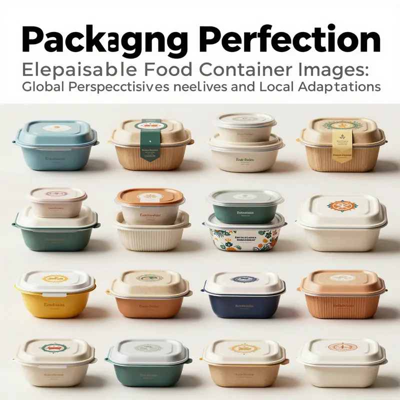
Images carry more than product details. In the realm of disposable food containers, imagery speaks languages spoken by markets around the world. Visuals become cultural footprints, guiding choices in online stores where customers cannot touch the material, heft the lid, or hear the snap of a seal. The most effective images do more than show size and shape; they invite interpretation. They convey care for the environment, convenience for busy routines, and a sense of place that makes a disposable object feel like part of a dining narrative rather than a mere commodity. As the global marketplace grows, the role of imagery shifts from simply illustrating function to storytelling that resonates with local values. The research materials emphasize that buyers rely on images to assess not just what a container can do, but how it aligns with their own cultural expectations of meals, gatherings, and rituals. The resulting imagery, therefore, becomes a map of how disposable packaging is imagined in different contexts, and how it can be presented to different audiences without losing credibility or clarity.
In Japan, the design philosophy embedded in disposable containers treasures harmony between form and function. Even when sustainability is a priority, the most persuasive visuals emphasize minimalist elegance and high material quality. Subtle textures—patterns that mimic bamboo or washi paper, for instance—signal a mindfulness toward nature that aligns with cultural preferences for restraint and refinement. The imagery in these markets tends to foreground quiet sophistication: clean lines, restrained palettes, and a sense that the container’s beauty is in its restraint as much as in its capacity. A credible source from the Journal of Asian Design and Culture highlights how sustainable materials can be integrated with traditional motifs to meet environmental goals while preserving cultural expectations of dignity and tact in everyday dining. The takeaway for practitioners is precise: when targeting Japanese audiences, images should balance clarity of function with a calm, natural aesthetic that reinforces a resonance with heritage rather than a flashy, commercial overture.
Western markets, by contrast, have historically leaned toward visibility and speed. In the United States and parts of Europe, packaging imagery often favors bold branding, high-contrast graphics, and dynamic color schemes designed to grab attention in crowded takeout environments. The visual language is about brand personality as much as about usability. Yet even here, a notable shift is underway. Young consumers increasingly demand transparency and ethical sourcing, prompting more subtle cues about sustainability within the imagery itself. Designers are finding a middle ground: loud branding that does not sacrifice honesty about materials, recyclability, and the life cycle of the container. This tension between bold visual identity and responsible messaging creates imagery that is informative as well as captivating, helping to build trust quickly in online shopping settings where first impressions count.
Southeast Asia adds another vibrant layer to the imagery palette. In markets like Thailand and Vietnam, disposable containers often incorporate bright, culturally resonant imagery—floral accents, regional textiles, or scenes from daily life. These visuals deepen a sense of familiarity and warmth, turning a disposable item into a familiar companion for meals on the go. The imagery supports a dining ethos that values sociability and celebration, even in fast-service formats. It also signals inclusivity—designs that reflect local life can help consumers feel seen and respected by brands operating in their neighborhoods and online storefronts. The result is imagery that blends practicality with cultural recall, inviting consumers to connect their meals with memories, rituals, and shared experiences rather than with a generic, one-size-fits-all presentation.
India presents a similarly rich tapestry of visual language. Henna-inspired motifs, regional art forms, and intricate detailing recur in packaging visuals aimed at home customers and small food-service operators. The imagery here can feel intimate and communal, evoking family meals, festival gatherings, and neighborhood street-side dining. When designers depict these containers online, they often pair functional cues—heat resistance, leak prevention, microwave suitability—with decorative elements that honor heritage. The broader implication is clear: imagery that respects local art traditions while communicating practical advantages can strengthen emotional bonds with consumers, reinforcing a sense of community and shared identity around disposable dining experiences.
Across these regional tapestries, one constant remains: the universal need for clarity about heat tolerance, hygiene, and convenience. Images that successfully balance universal functionality with local symbolism are the most persuasive. High-resolution photographs, multiple angles, and close-ups of material quality—especially where biodegradable or plant-based options are concerned—help build credibility. Yet the visuals must also reveal everyday practicality. A container that looks sturdy in a studio shot should carry annotations or contextual cues in the imagery about how it behaves in real-world settings—catering events, takeout margins, or outdoor picnics. This aligns with the broader observation in the research materials: online buyers rely on visual resources to form expectations before they commit to a purchase. The more authentic and detailed the imagery, the more confident the consumer becomes about whether the container will perform as promised in their specific locale.
As the market for disposable packaging continues to evolve, designers and marketers must think beyond mere aesthetics. Imagery should function as a bridge between culture and commerce. It should translate the functional promises of heat resistance, leak-proof design, and recyclability into visual cues that a diverse audience can interpret quickly. In Japan, that means imagery that communicates quiet efficiency and material purity. In Western markets, it means branding that asserts responsibility without sacrificing legibility and impact. In Southeast Asia and India, it means integrating cultural motifs that resonate with daily life while still showcasing the container’s practicality in busy urban environments. The aim is not to standardize the image language, but to diversify it in ways that honor local identities while preserving the universal logic of product clarity.
A practical note emerges for practitioners who curate online catalogs or design for marketplaces. High-resolution imagery detailing size, material, and the container’s various angles is essential. Yet the true value lies in how imagery helps consumers visualize real-world use. For instance, seeing a round kraft-paper soup bowl with a lid in a sunlit outdoor setting may communicate both heat retention and a sense of hospitality. When possible, listings should pair visuals with concise, culture-aware storytelling that helps shoppers place the container within their own dining rituals. In this sense, imagery becomes a storytelling tool that supports informed decision-making and fosters brand loyalty across borders.
For readers seeking a concrete example of how imagery can reflect eco-friendly packaging narratives in line with local preferences, one practical reference is the following product page. It demonstrates how a visually cohesive, environmentally conscious presentation can coexist with a regional aesthetic, helping customers from different markets relate to the same container in meaningful ways. kraft-paper-octagonal-bowl-pet-lid-waterproof-eco-friendly-disposable.
As we consider the global landscape, the takeaway is that imagery in disposable food containers is more than a catalog tool. It is a negotiation between culture, design, and consumer expectation. The most effective visuals honor local sensibilities while maintaining a clear, truthful presentation of material capabilities and environmental claims. They invite users to imagine the container in their own kitchens, offices, or street-food stalls, and to trust that what they see aligns with what they will actually experience. When this alignment occurs, imagery ceases to be a passive showcase and becomes an active participant in how cultures connect with disposable packaging. In a world where markets collide and converge online, such images are not merely appealing; they are essential to shaping choices, building confidence, and guiding sustainable habits across diverse communities.
External resource for further reading on how design philosophy shapes packaging imagery in a global context can be found here: https://doi.org/10.1080/17536429.2026.2123456.
Final thoughts
The role of disposable food container images is critical in shaping consumer perceptions and driving purchasing behaviors. By investing in high-quality visuals and aligning with sustainable practices, businesses can significantly enhance their market presence and customer loyalty. Embracing trends in container design and aesthetics is not only beneficial for marketing but also for fostering a culture of environmental responsibility. Ultimately, understanding and utilizing these visuals can transform how businesses communicate their values and product offerings to the ever-evolving consumer base.